time-vis
Other people did some amazing time visualizations, I collect them here.
The Museum of the World
https://britishmuseum.withgoogle.com/
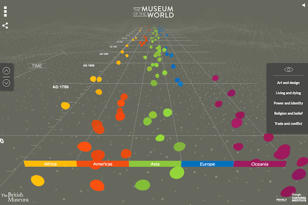
Discover objects from the British Museum’s collection from prehistory to the present. This amazing interactive is created using WebGL. Screenshot doesn’t do a justice, check out the actual page.
Similar visuals:
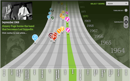
Guardian’s Music Timeline (requires Flash player 😞)
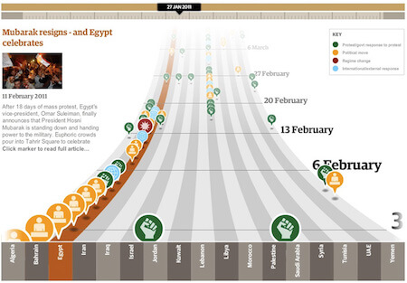
Guardian’s Arab Spring - The Path of Protest (requires Flash player 😞)

Histography
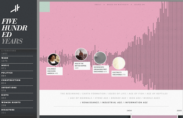
“Histography” is interactive timeline that spans across 14 billion years of history, from the Big Bang to 2015. The site draws historical events from Wikipedia and self-updates daily with new recorded events. Interactive visual uses Pixijs on top of WebGL.
Five Years of Traffic Fatalities
https://io9.gizmodo.com/5970486/visualizing-5-years-of-traffic-fatalities-what-is-the-deadliest-time-to-drive
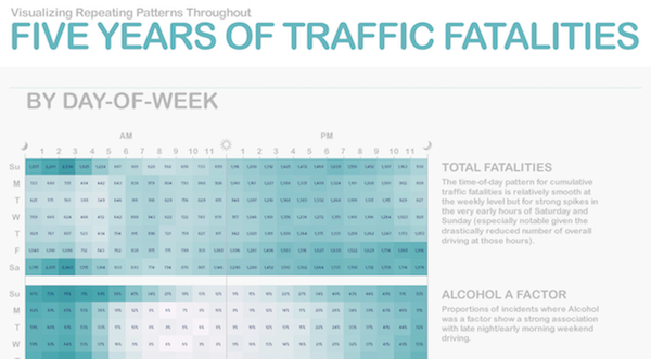
Five years of traffic fatalities across the United States visualized on a Calendar Heatmap.
Similar visuals:
Flowingdata: Calendar of Fatal Crashes
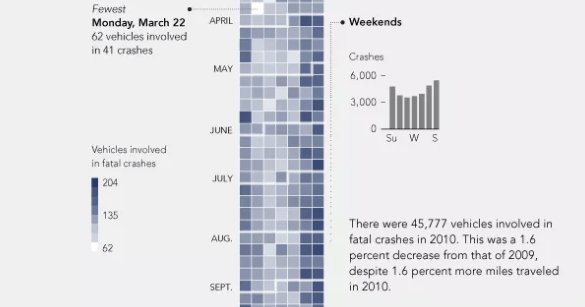
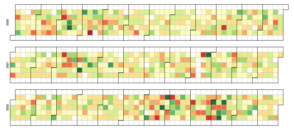
Github User Contribution Activity

Mountains out of Molehills
http://www.informationisbeautiful.net/visualizations/mountains-out-of-molehills/
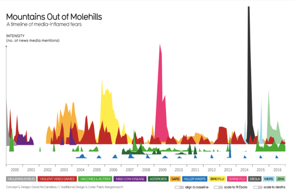
Normally, area chart + overlapping metrics + 3D space is the perfect recipe for a disaster. Except, it isn’t in this visual. This interactive visual delivers the message clearly without any interaction. Neat colors, meaningful interactive options and positioning in (surprise!) 3D space makes this visual great.
Time Machine (MacOS)
https://en.wikipedia.org/wiki/Time_Machine_(macOS)
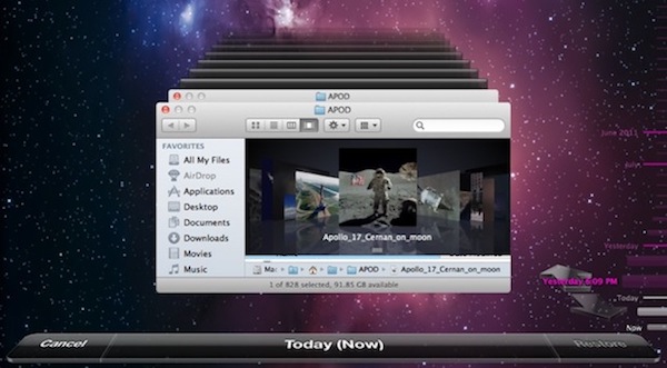
Time machine allows an increadibly easy way to navigate through the folder snapshots. The timeline on the right is useful to see a “big picture” of all backups and jumping into a particular time frame.